Baurine's Blog
使用 flex layout 实现 fixed header 和 sider
April 10, 2019最近实现了一个需求,一个页面,需要固定的 header,固定的左侧栏,右侧的内容部分又有一个左侧栏,这个左侧栏也需要固定,其余的内容是正常展示,超出的部分显示滚动条。左侧栏虽然是固定的,但如果内容超出页面高度,也显示滚动条。
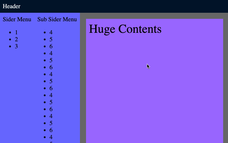
效果大致如下所示:
代码:CodePen
因为项目用了 React 和 Ant Design,Ant Design 有 Layout / Header / Sider / Footer / Content 等相关布局组件,根据文档,实现起来很快很方便,代码如下所示:
import { Layout } from 'antd'
const { Header, Sider, Content } = Layout

...
render() {
  return (
    <Layout>
      <Header>
        <div>Header</div>
      </Header>
      <Layout>
        <Sider>
          <div>Sider Menu</div>
          <ul>...</ul>
        </Sider>

        <Layout>
          <Sider>
            <div>Sub Sider Menu</div>
            <ul>...</ul>
          </Sider>

          <Content>
            <div>Huge Contents</div>
          </Conten>
        </Layout>
      <Layout>
    </Layout>
  )
}
好奇它是怎么实现的,于是通过 inspect,把它用原始的 html 和 css 翻译了一下,如下所示:
// html
<div class='container'>
  <div class='ant-layout'>
    <div class='ant-layout-header'>
      Header
    </div>

    <div class='ant-layout ant-layout-has-sider'>
      <div class='ant-layout-sider'>
        <div>Sider Menu</div>
        <ul>...</ul>
      </div>

      <div class='ant-layout ant-layout-has-sider'>
        <div class='ant-layout-sider'>
          <div>Sub Sider Menu</div>
          <ul>...</ul>
        </div>

        <div class='ant-layout-content'>
          <div class='my-content'>
            Huge Contents
          </div>
        </div>
      </div>
    </div>
  </div>
</div>

// css
html, body {
  margin: 0;
  /* very important */
  /* height: 100%; */
  /* width: 100%; */
  font-size: 20px;
}

.container {
  /* very important */
  height: 100vh;
}

.ant-layout * {
  box-sizing: border-box;
}

.ant-layout {
  height: 100%;
  background-color: #666;

  display: flex;
  flex-direction: column;
  flex: auto;

  min-height: 0; /* fix bug in firefox */
}

.ant-layout.ant-layout-has-sider {
  flex-direction: row;
}

.ant-layout-header {
  flex: none;
  background-color: #001529;
  color: white;
  padding: 10px;
}

.ant-layout-sider {
  background-color: #6666ff;
  padding: 10px;

  flex: none;
  overflow-y: auto;
}

.ant-layout-content {
  flex: auto;
  overflow: auto;

  min-height: 0; /* fix bug in firefox */
}

.my-content {
  margin: 20px;
  padding: 10px;
  font-size: 40px;
  height: 2000px;
  background-color: #9966ff;
}
最终效果就是上面那个 gif。
Layout 对应的 css class 是 ant-layout,Header 对应的是 ant-layout-header,Sider 对应的是 ant-layout-sider,Content 对应的是 ant-layout-content。
注意,实现这个效果有一个很重要的地方,我也是 inspect 也很久以后才发现,首先就要限制整个页面的高度就是 window 的高度,有两个实现方法,一是在给 html 和 body 设置 height: 100%; 的 style,Ant Design 是这么做的;一种是在最外层加一个 div container,设置 height: 100vh; style。如果不做这一步的话,效果是无法实现的。
ant-layout 作为 flex 容器,ant-layout-header / ant-layout-sider / ant-layout-content 作为 flex 容器的子元素。但 ant-layout 可以嵌套,所以它也是 ant-layout 的子元素。
ant-layout 使用 flex 布局,默认是上下布局 (cloumn),但如果里面有 sider,则要给它加上 ant-layout-has-sider class,.ant-layou.ant-layout-has-sider 会使 flex 变成左右布局 (row)。
ant-layout-header / ant-layout-sider 作为子元素,它们的 flex 属性是 flex: none; 即 flex: 0 0 auto;,它们的尺寸即不拉伸,也不压缩。
ant-layout 作为子元素时,它的 flex 属性是 flex: auto; 即 flex: 1 1 auto;,它的尺寸会占握父容器中所有剩余空间,有多余空间时拉伸,空间不足时压缩。
同时 ant-layout 还有 height: 100%; 的 style,这样能保证它作为页面的顶级节点时可以占据整个页面的高度。
ant-layout-content 作为子元素,它和 ant-layout 一样,flex 属性是 flex: auto;,这意味着它也占据所有剩余空间,但它同时还有 overflow: auto;,这表明,如果内容超出页面高度或宽度,会显示滚动条。
这样,就很好理解上面这个效果是怎么实现的了。
首先,最外层是上下结构,ant-layout-header 占据自身内容的高度,下面剩下所有空间被 ant-layout 占据。下面的 ant-layout 变成左右结构,左侧的第一层 ant-layout-sider 占据自身内容的宽度,右边剩下所有空间被 ant-layout 占据。右边的 ant-layout 仍然是左右结构,左侧 ant-layout-sider 占据自身内容的宽度,右侧剩下所有空间被 ant-layout-content 占据。又因为 ant-layout-content 设置了 overflow: auto; 属性,它的内容如果超出容器高度或宽度,则显示滚动条。
我们再来对比一下用 flex 和用传统方法的实现,看看 flex 的优势何在。
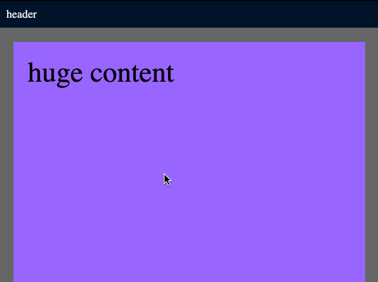
来看一个最简单的例子,只固定 header,下面的内容滚动显示。
layout:
// html
<div class='layout'>
  <div class='layout-header'>
    <div class='my-header'>header</div>
  </div>
  <div class='layout-content'>
    <div class='my-content'>huge content</div>
  </div>
</div>>

// css
html, body {
  margin: 0;
  background-color: #666;
}
.my-header {
  background-color: #001529;
  color: white;
  padding: 10px;
}
.my-content {
  margin: 20px;
  padding: 20px;
  font-size: 40px;
  height: 2000px;
  background-color: #9966ff;
}
初始效果:
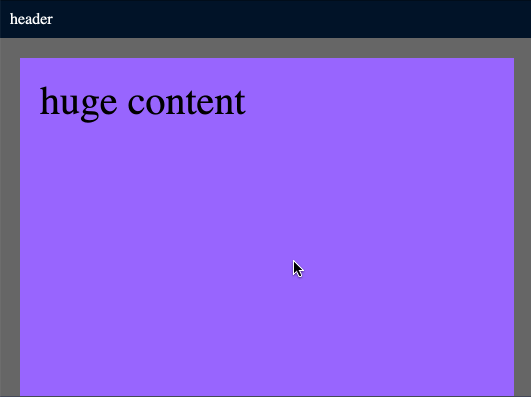
目标效果:
flex 的实现
把 .layout class 设置为 flex 上下布局,.layout-header 的 flex 为 none,.layout-content 的 flex 为 auto,overflow 为 auto。以及 html 和 body,.layout 的 height 为 100%。
html, body {
  margin: 0;
  background-color: #666;
  height: 100%;
}
.layout {
  height: 100%;
  display: flex;
  flex-direction: column;
}
.layout-header {
  flex: none;
}
.my-header {
  background-color: #001529;
  color: white;
  padding: 10px;
}
.layout-content {
  flex: auto;
  overflow: auto;
}
.my-content {
  margin: 20px;
  padding: 20px;
  font-size: 40px;
  height: 2000px;
  background-color: #9966ff;
}
效果:
position: fixed
设置 .layout-header 的 position 为 fixed,设置 top 为 0 使之置顶,如此设置之后发现 content 的一部分内容被 header 遮挡住了,于是我们要把 content 的 margin 再增加一个 header 的高度,因此,这就是使用 position: fixed; 一个弊端,必须知道 header 的高度,要么给它一个固定的高度,要么运行时用 js 动态计算。
所以我们给 .layout-header 一个固定的 38px 高度,对 .layout-content 设置一个 margin-top 为 38px,同时设置 overflow: hidden; 使之成为一个 BFC,消除和 .my-content 的 margin collapse。
html, body {
  margin: 0;
  background-color: #666;
}
.layout-header {
  position: fixed;
  top: 0;
  width: 100%;
  height: 38px;
}
.my-header {
  background-color: #001529;
  color: white;
  padding: 10px;
}
.layout-content {
  margin-top: 38px;
  overflow: hidden;
}
.my-content {
  margin: 20px;
  padding: 20px;
  font-size: 40px;
  height: 2000px;
  background-color: #9966ff;
}
效果:
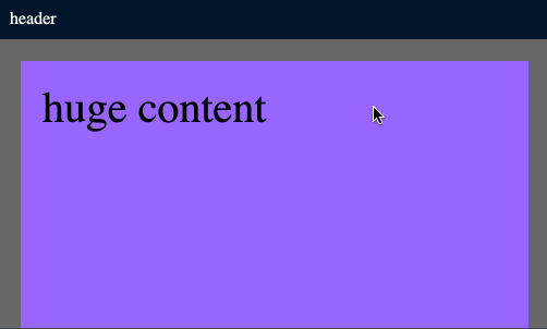
注意,它的滚动条是从 window 的最顶部开始的,而 flex 方案是从 content 区域开始的。
原始布局
原本 div 就是上下布局,所以我们尝试一下既不用 fixed 也不用 flex,css 如下所示,最终效果和 flex 是一样的。核心在于将 .layout-content 的尺寸设置为页面高度减去 header 的高度,overflow 为 auto。header 需要一个固定高度。
html, body {
  margin: 0;
  background-color: #666;
  height: 100%;
}
.layout {
  height: 100%;
}
.layout-header {
  height: 38px;
}
.my-header {
  background-color: #001529;
  color: white;
  padding: 10px;
}
.layout-content {
  height: calc(100vh - 38px);
  overflow: auto;
}
.my-content {
  margin: 20px;
  padding: 20px;
  font-size: 40px;
  height: 2000px;
  background-color: #9966ff;
}
结论:flex 更方便和灵活,不需要知道 header 和 sider 的尺寸。